When you type on your computer, there will be a set of text characters displayed on the screen. They make it easier for you to read as well. Those are fonts. The set of ext characters that are also printable. It is also often for us to change the style or design of the font. That’s what you call typeface. There are wide selections of typeface you can choose since it’s available on your computer. Some people may call text character as font and some others call it typeface. Well, there is not much thing to argue about since they are often used interchangeably anyway.
Calibri
If you want to make it clear, Calibri is a typeface family, Calibri italic is a typeface and Calibri italic 11-point is a font. In other words, a font is also a set of typeface and other qualities including pitch, size, space, etc. For example, Time Roman is a typeface. It also defines each of character’s design. However, you can see that within this typeface, there are many fonts you can choose as well different in size, bold, italic, etc. Even if you refers to font as typeface, then it doesn’t really matter because the most important thing is you know how to use it.
As mentioned before that font choice varied from size, height, thickness, etc. To measure the height of the font, we use points. There are choices of points from 1 to 72 inch. They will appear in different size when the text on the display being printed. Meanwhile, we call pitch to measure the width of the fonts. The pitch measure how many characters that can fit in an inch. 12 and 10 are the most common pitch values of fonts. If your fonts has the same width, they are said to be fixed pitch. It will be called proportional font if the widths are varied in shape.
Various Types of Fonts
Fonts are varied and most applications support and enable various type of them. For example, you can choose more varied types of fonts. Well, talking about fonts in technical terms is a bit confusing. It is because every computer and device have their own methods to represent fonts. There are bit-mapped and vector graphic system. They define and represents fonts differently but they are too technical to discuss.
The choice font usually depends on the purpose of the writing. If it’s for academic writing, the most common font being used include Times Roman and Arial. For academia, the fonts should be easy to read. It is the main priority in font choice. That’s why Times Roman and Arial are the most used. You can say they are the standard fonts of academic writing. However, the choice can be different for marketing, artistic, and other purpose. Fonts for ads are usually chosen based on the mood or image of the brands themselves. You can choose any fonts you like for other than academic or publishing purpose.
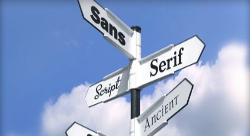
Readability Of Letters In English In Front Of The Screen.
Readability Of Letters In English In Front Of The Screen. When it comes to designing, printing, publishing, and advertising, the font issue is one of the most common to discuss. It may seem insignificant but the choice of font can affect significantly to the overall concept of design made for any purpose. Be it academic or commercial purpose, fonts do matter. Basically, you can just choose typeface or fonts that have been available as default setting on your device for bola 88, be it smartphone, laptop, PC, etc. For some designers though, they need more flexibility to set the type of fonts they really like.
Readability Of Letters In English In Front Of The Screen.
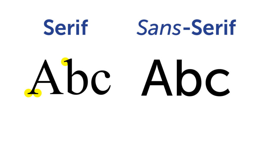
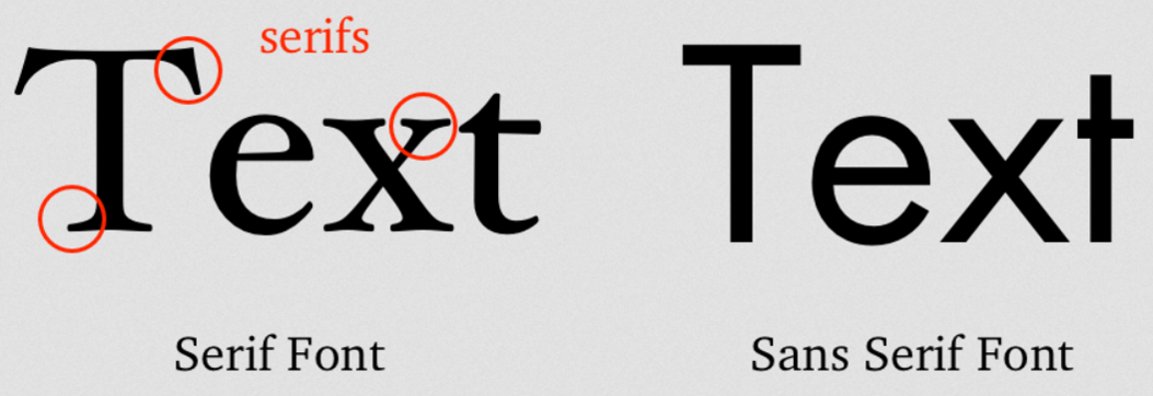
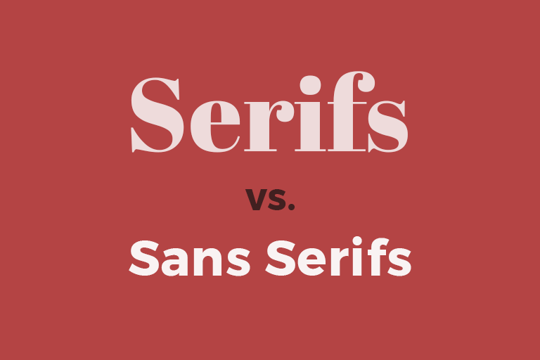
In general, there are two types of fonts. They are serif and sans-serif. If you see serif fonts, you can see that there are structural details adorning the ends of the lines of characters or numbers. Meanwhile, sans-serifs don’t have those details. Many may think that serifs are more readable compared to non-serif fonts because the additional details themselves were made to aid to the eyes. However, there is not always the case.
In many cases, serif fonts are more readable on-screen. Thus, many people choose variations of serif fonts such as serif Georgia to type then print it. However, they maybe different for design, especially web design. The fonts should be readable on screen. However, not all screen is in has high resolution. Some of them have low resolution which make almost any fonts look less readable on screen. Thus, fonts that are good to print doesn’t always look great on screen and vice versa. Printers have higher resolutions than computer screen. It can be ten times higher. Thus, printers can catch every details given to the fonts. Meanwhile, fonts on screen should rely to the resolution as well. More often than not, the lack of pixels make it not enough to display the details of the fonts clearly.
Therefore, it is often more on the device factor when it comes to choose the best fonts with great readability on screen. If the device has high resolution with enough pixels, the fonts even the non-serifs ones will look easy on the eyes. If it a must to choose, sans-serif fonts are more superior for screen body text. Meanwhile, serif fonts are great for headings. If you have newer displays, there is not much issue regarding to font choice based on readability.
Font’s readability is often personal choice as well as eventual. There are typefaces and fonts that work best for a group of the best choices. The situation is also influential to the choice of font. For example, the choice of fonts and the level of readability can be different for academic and commercial purpose. Among all typefaces and fonts though, Helvetica and Arial can be considered as the most common used fonts with the reason is that they deliver great readability on screen and body text. There are also overused fonts even if they don’t really look great in readability such as comic sans, gothic, garamond, and many more.
How To Choose The Best Between Serifs Fonts And Non-Serifs Fonts.
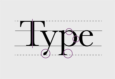
How To Choose The Best Between Serifs Fonts And Non-Serifs Fonts. Basically, there are serifs and non-serifs you can choose for printing materials or publishing. Serif fonts are also known as little feet. You can see that ‘little feet’ appear at the ends of every letter. There are wide variety of serif fonts you can choose for various purpose. If you are into designing, there are wide selections of them. For designing or branding, serifs fonts are often used because they look more interesting and attractive with all additional details. However, serif fonts still look clean and elegant even with all those details.
Font Serifs And Font Sans Serifs(non-serisfs).
Fonts are significant both for academic and commercial purpose. The choice of fonts can create certain moods and feels. That’s why fonts do matter for designers. For example, a logo is important for a brand to represent its image. The choice of fonts in the logo also matter to create an image that the brand want to to present to the audience. If the fonts resonate the image that the brand wants to show, the impact will be great to the brand. Unique logo with the help of interesting fonts will be reminded for a long time.
There are many serifs fonts you can choose from. Here are several of my favorites you may consider especially if you are into design:
Hermann font family provide great readability and one of the most favorites for design teams. It was inspired by the novel of Hermann Hesse in the 20th century. He was one of the most profilic authors at that time. The font itself delivers wildness as well as surrealism and duality. If you want to create a mood of wild and bold, the choice of Hermann font can be great. It is available as well in various options including old and italic.
Blacker is another great choice of serif font you can choose. This is a wedge type of serif font with high contrast. It was created in 1970 by Cosimo Lorenzo Pancini and Andrea Tartarelli. In Blacker, you can see that the font look superior with all the features highlighting the letters. There are varieties of Blacker you can choose with two optical sizes as well as six weights.
Linotype Didot is such a classic, elegant font that was created a s tribute to the Didot family. They are one of the most respectable print shop and font foundries in France. The intricate design and elegant style still featured authenticity of the original Didot family.
Recoleta is also an interesting font you can use for many purpose especially logo design. This font has more modern, fresh, new look to it. The shapes are characteristically gentle and soft. However, it also has fluid strokes angled in every character. Recoleta looks familiar but still has business-y vibe. That’s why this font is also often used in business logo or business card. The font looks professional but still in a non-intimidating way. There are also other font options of Recoleta based on its weight that are good for headings.
The Most Suitable Type Of Letter For Writing Resume.
The Most Suitable Type Of Letter For Writing Resume. In the past, resume was hand-writing. Today, most companies or organizations allow applicants to send their printed or digital resume. Searching for a job at http://104.248.154.61 is challenging. There are so many things to consider such as salary ranger, location, position, commute availability, and more. Thus, it is often for job seekers to forget about resume. It is essential because it’s what catch the attention of the employer’s eyes. One tiny detail you should not ignore is the font choice on your resume.
Best fonts to write resume.
The tiny detail of resume such as font choice can be significant when looking for a new job. For job seeker, the best chance to make first impression is through resume. When employer opens your resume in the first few seconds, it should be interesting and eye-catching, in professional way. If you choose playful or cute fonts with lack of readability, your resume might be just dismissed.
here are many types of fonts in serif or sans-serif family. Here are the recommended fonts to choose for making resume:
Calibri
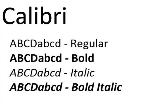
Calibri is the default font of Microsoft Word. It has replaced Time New Roman. Calibri then has become the safest option of font to use for any purpose such as academic writing, publishing, advertising, etc. Calibri is part of sans-serif font family. The characteristic of this font is universally readable. A resume with Calibri font is easier to read because the space, the height, and the style are comfortable to in the eyes.
Cambria
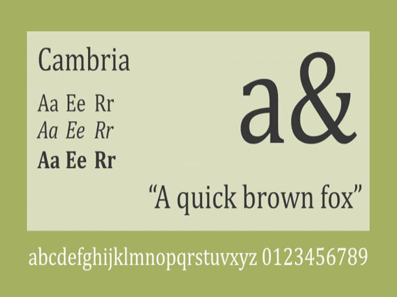
Cambria is serif font that can be considered one of the most popular. It is also a staple for Microsoft Word. It was created in 2004. This font is great choice for a resume because it has great on-screen readability. Not to mention that it is good for printing materials. This is also considered traditional and classic option of a font. However, it is suitable for resume which requires professional impression to be attractive.
Garamond is also considered as traditional or old-style font. It is suitable for a resume because it is easy to read. This font itself was named after Claude Garamont, a French type designer. This font is also often used for academic purpose. Those who have more work experience usually choose this font to write their resume as well.
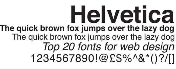
Helvetica is such a popular sans-serif font that has been used for various purpose including in professional industry. This font has characteristic of clean and modern look. Lots of designers and typographers use this font. Lots of huge brands have used this font as well such as Panasonic and Jeep. This font is also said to have business-y mood.
Trebuchet MS is a sans-serif font that looks less traditional. This font is on-screen friendly which is easy to read as well. Another point of this font is more texture to it, making its look more modern than other traditional fonts such as Georgia or Cambria. However, it still has business-y mood to it, making it is still appropriate to be on resume.
The Most Common Font Types Used By Most People.
The Most Common Font Types Used By Most People. Fonts and typefaces have been significant parts of our society especially in reading and writing. It has been like that for centuries even before digital era exist like today. Typography has been improved in so many ways especially with the way digital era works now. Digital typography has become essential in our life. Fonts are not insignificant because they can tell you many things. They have their own impact to design https://tehnuk.com/. They can create specific moods and feel to the audience. Thus, those characters you often see even in ads are made and chosen with purpose.
Popular Fonts You Can Choose For Any Purpose.
Choosing fonts often depends on the purpose. As mentioned, the fonts have effect to create particular moods and feel to the audience. Thus, choosing fonts does matter especially for academic, web designing, printing, publishing, etc. Here are several most common or popular fonts people use for various purpose and needs:
Helvetica Fonts
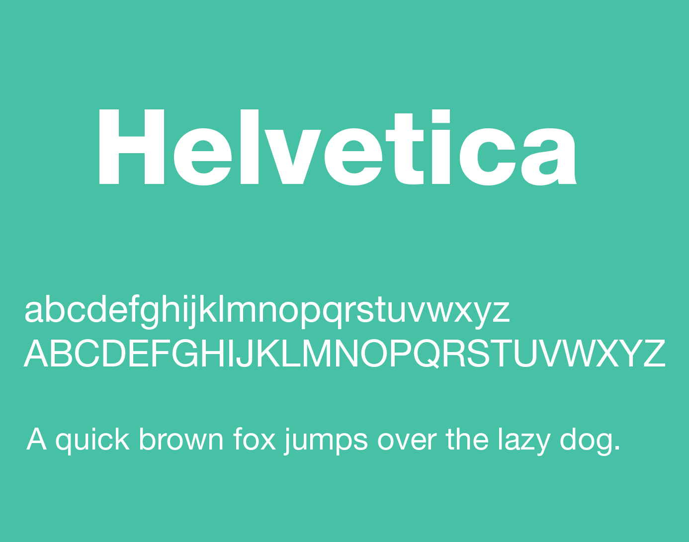
Helvetica is often referred to as the most popular typeface. There are various fonts types you can choose in Helvetica family. This typeface was designed by Max Miedinger, a Swiss designer. It was born in 1950 and has been used for various purpose since then. This is one of the most classic typeface. Even in this modern era, Helvetica is still used by many.
Times Fonts
Times is also considered one of the most popular typefaces and there are various fonts to choose from. It was designed by Stanley Morison who was unimpressed by the newspaper printing quality of a London daily or ‘The Times’. He was hired by the manager of the newspaper company, William lints-Smith to redesign his paper. Morison created his own typeface with name Time New Roman. It has become popular typeface to use since then, especially for publishing and printing materials.
Gotham Fonts
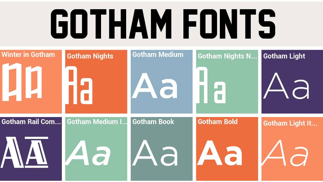
Gotham is such an iconic font. You may be more familiar with the term gothic font. Gotham itself is the adaptation of Gothic, the 20th century American Sign maker. The characteristics of Gotham is its clean and modern vibe. Not to mention that its intricate style makes it look more interesting especially to be used in entertainment industry.
Futura has such a unique style for a typeface. It was designed by Paul Renner in Germany. It was officially born in 1920s. it has remarkable, interesting shapes of font choices. This is also considered as one of modern typefaces. Many designers have been influence by this typeface. Business and advertising industry is the most common to use this typeface. One of massive brands that has been using this modern typeface is Volkswagen.
Gill San is was created by Eric Gill in 1928. Monotype Corporation is the one that produced this English font. This is considered as one of the most eligible sans serif fonts. This design of font was influenced by Johnston who created and designed Johnston Font. Lots of designers use Gill San font today. There are wide selections of font weights as well as other variants to meet your needs.

Fonts Choices In The Middle Ages Are Enchanting.
Fonts Choices In The Middle Ages Are Enchanting. You may be familiar with Gothic font since it is one of the most common used for many purpose especially publishing and printing materials at http://128.199.145.222. Gothic font is part of medieval font family. The medieval font refers to the fonts type with a solid piece of realistic and contemporary craftsmanship design. Medieval fonts are known for their enthralling and appealing look. In regard to structuring and composing, medieval fonts assume a very impactful job. Medieval fonts also provide business-y look with an antiquated atmosphere.
There are free medieval fonts you can choose from. They still have extraordinary design highlighting the vibe of medieval era. Textual style’s design is important to catch the eyes of the audience. You can utilize every medieval fonts incorporating diversion, illustration, etc. Here are several most popular medieval fonts:
Ringbearer Font
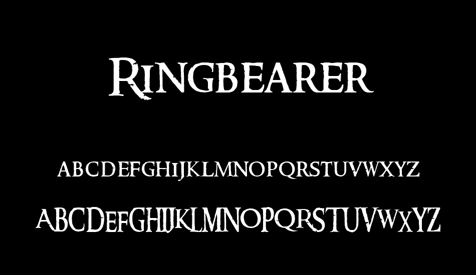
Ringbearer font is an interesting medieval font where you can see medieval vibe. It has interesting height to the structure with a sense of mystic. You can see this font in the logo ‘The Lord Of The Rings’ set of three by Peter Jackson. This type of font is best used for various web composition as well as any other ventures.
Salterio Shadow Font
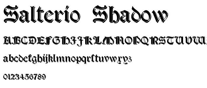
Salterio Shadow Font has unique feature with its dramatic strokes. Not to mention hat diagonal features make its design to look more complicated but beautiful. There is also a mysterious vibe when you see the design of this font. It is good for making thriller movie posters. However, this font are still good both for individual and business designs.
Kent font
Kent font is unique and interesting medieval font. It looks like a handwriting in medieval era. Thus, it looks classy and this elegant font is great to be used for various purpose. The design is also alluring. The font is also vector outlined, making it look more intricate. If you are into artistic web design, this type of font can be a great choice.
Black Chancery font
Black Chancery font really has medieval design to it even in a short glance. It has calligraphic vibe to ti which make this font looks more enthralling. Black Chancery italic is also great option for web design or logo. It oozes out superior quality through its strong yet soft strokes. With alluring hues, you can create incredible design using this medieval font.
Fenrir
Fenrir typeface is a great choice if you want to to highlight medieval vibe to your design. This font has solid vintage feel with 6 diverse style alternatives. This font also incorporates various factors including English capitalized letters, numbers, substitutes and accentuation. If you want to create such a classic or vintage venture to your design, this font can resonate well with it.
Perry font
Perry font is a medieval font that comes with wide variety of hues and format you can set to create your individual design. Aside from looking too vintage, this font also has delightful look to it. The duality of this font makes it suitable to use for any purpose. If you want to show expertness, this font is such a great choice to consider.
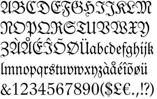
Very Interesting Facts About Ancient English Fonts.
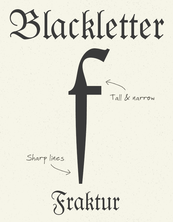
Very Interesting Facts About Ancient English Fonts. You may have heard about old English Fonts or some dadu online people refer it to the Blackletter typeface. This kind of types was once used in one of the oldest books to be printed in Europe called Guthenburg Bible. It was one of the very first books that was printed at that time. The Blackletter typeface was often used at that time due to its interesting features. It has unique strokes which features think and thick lines. You can also see that some of the Blackletter fonts has additional swirls especially on the serifs. The Blackletter typeface was said to be inspired from early manuscript lettering.
The Blackletter Typeface.
Very Interesting Facts About Ancient English Fonts. The Blackletter typeface has been evolved from the mid 12th century. It started in Western Europe. Then, wide variety of Blackletter has appeared over the time. However, there are are at least four family that can be considered most remarkable. They are Rotunda, Textura, Fraktur, and Schwabacher. You can find yourself the difference between the families. The differences of the serifs are really significant and visible that you can identify them in short glance.
It is true that one of the most interesting parts of the Blackletter fonts is the dramatic strokes between thin and thick lines. It makes the characters look more mysterious, classic, traditional, and artistically beautiful. There are also diagonal, thin serifs on lower case letters. The use of the Blackletter typeface was only for bible and books during Guthenburg era. However, it marked the the new era of the use of this font for printing as well. Blackletter fonts are beautiful to look at but still difficult to read as body text. If it is compared. Roman and Italic are much easier to print.
The reason of being less readable for printing was also the cause of why in 1500s, Blackletter typeface was less popular for printing. However, it was different in Germany. This country still continued to use the fonts back then until the early 20th century. Then, the use of this typeface was getting rare. It was even considered to be antiquated by German publishers and designers at that time. It was replaces by new typography of various sans serif typefaces.
Very Interesting Facts About Ancient English Fonts.
The new typography was declared to be un-German by Hitler. Then, Fraktur continued to be used as Volk, or the people’s fonts by Nazis. Only until 1941 it was replaced by more readable fonts. Lots of people associate Blackletter typeface as Nazi fonts. However, it is not true at all. There are real history behind Blackletter typeface. You can check it out on various sources if you want to learn more about it.
Blackletter fonts are best to used for heading instead of body text because as mentioned earlier that it provide less readability in body text. Blackletter is also great for making logos, signs, posters, and commercial advertisement. This typeface is also often used in certificate because of its classic and intricate design. There have been free Blackletter fonts you can download if you are interested in using them for any purpose.
Most Popular Fonts Used For Advertisement
Most Popular Fonts Used For Advertisement to get more income. The role of fonts is significant to any kind of design or artwork, including in advertisement. If it was not important, why would there be so many variations of font? Font choice can affect to the design. For example, you are making poster to promote your special event on Halloween. In the poster, you are using comic sans fonts. Some people might think it is not suitable because the font choice. The poster will have better design and if the font choice is gothic or something similar to it. The style of the font can affect the mood of the overall design even if it looks minor. In fact, small detail like that often gives powerful impact.
In advertising, font does matter because it is expected to create the image the brand to their audience. If a brand wants to deliver professional and credible feel through their logo, they will be more careful in choosing the font. They won’t use jokerman, comic sans, or gothic fonts. They are rare fonts to be used in such professional settings. In advertising, the font is also chosen to create certain feel and mood. Here are several popular fonts often used for advertisement:
Most popular fonts everybody will use
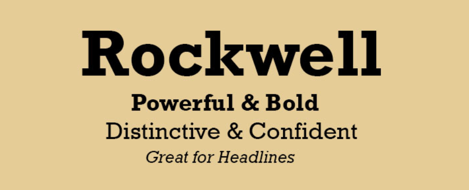
Rockwell is one of the most popular fonts, especially in design. Its first appearance was with Monotype Design Studio in 1934. Rockwell is often used because of the geometric form. It has been often used as a display font. The characters of Rockwell fonts are considered flexible as well as strong. There is quality in the design of each font style. Rockwell also has great readability so it is great for advertisement that aim for more audience to notice.
Helvetica is a popular font without a doubt. It is used for various purpose. It is often used for printing, publishing, and commercial purpose. This font goes well for advertisement for situs judi online industry. It also looks familiar because it’s recognizable around the world already. The original typeface of Helvetica was Nueue Haas Grotesk developed by Max Miedinger in 1957. then, it has been developed over the time, there have been many different weights developed to this font.
Good choice font for advertisement
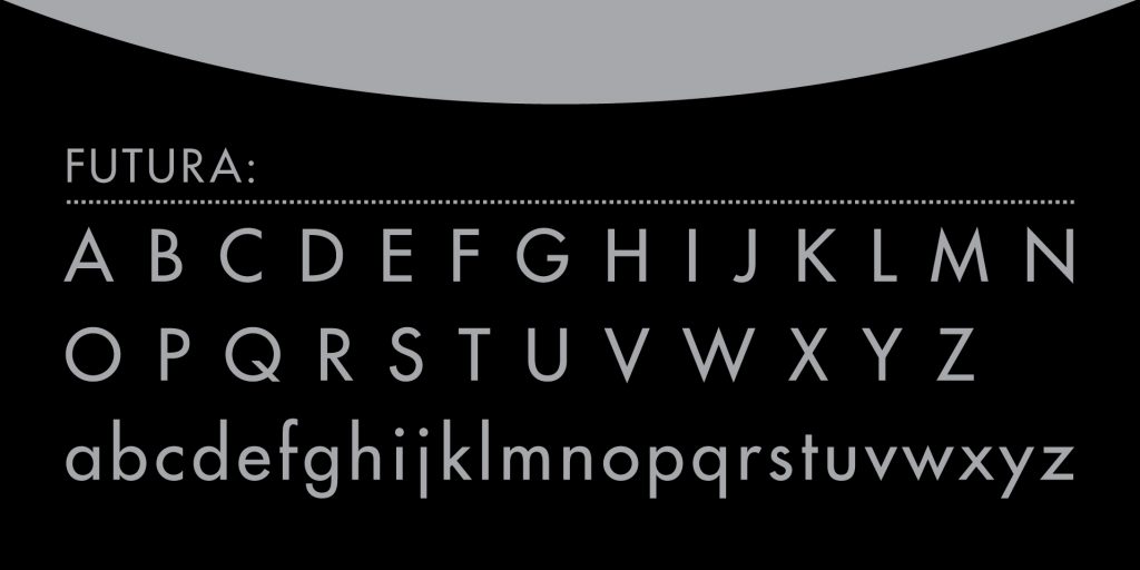
Futura has great readability for typeface. Meanwhile, it looks great in style as well. This font was firstly designed in 1928 by the Bauer type Foundry. This font is also recognized to have modern style with generous line spacing as well as clean edges. The elegant look of this font makes people love it even more. It also provides clearance to the concept, making it easy to notice. It is one of the most important elements in advertising.
Neo Sans is a stylish font you can use for advertisement. It has ultra modern vibe to it. You can see the unique yet simple characteristics through the open letters and simple structures. Not to mention that the smooth curves make this font look even more classy. Many agree that this font is capable to look classic and cutting-edge at the same time. You can easily express specific nuance using this font for advertisement.

Attractive Free Fonts You Can Choose For Designing
Attractive Free Fonts You Can Choose For Designing. When you are a creative, there is something that always make you feel like you are perfectionist. You pay lots of attention to various minor details to deliver the best project. It includes choosing the right font. For some people, fonts are not that serious. However, it is different fro designers and creatives. Font choice does matter to a project. A font has their unique characteristics that can resonate with your brand identity. Choosing the right font also help you to deliver the message you want to convey better. Not to mention that some fonts are aesthetically pleasing, enough to catch the attention of many viewers.
Choosing the right fonts means you have to see if you yourself can read it and if it fits your brand. Readability and aesthetic of fonts are important to consider. The balance and consistency of a font’s qualities do matter as well. For your design projects, here are several great fonts to consider as good choice:
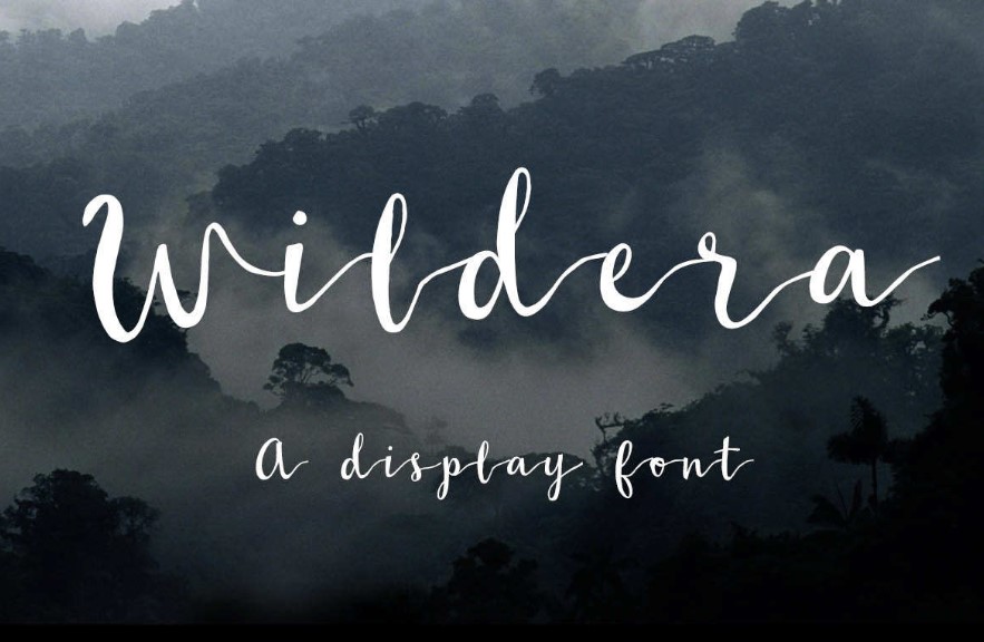
Wildera Regular
Wildera Regular is one of attractive free script fonts that looks interesting and unique. It is like a handwriting but still has good quality on its readability. The space between two characters are even and the string connecting each character is made to be thinner than the character so it is still easy to read. If your project has the vibe of whimsical or magical, this font is good to consider.
There are also several good choices of free serif fonts such as Canvas and Butler. Canvas has that professional vibe to it which can show credibility and trustworthy of your project. There is a combination between thick and thin strokes of each character. This font look formal and creative at the same time. As for Butler, you can see this font aesthetically pleasing while still manage its eligibility. This modern serif typeface has 14 different weights you can choose from. They look clean, neat, professional, and firm.
Modern Fonts
There are also modern fonts you can choose such as Moon or Bourbon Grotesque. Moon has the sense of clean and neat font but still look attractive. You can see that the cut-edges are clean and rounded. They look sharp and soft at the same time. This is great for design project that want to highlight the point of simplicity. Meanwhile, Bourbon Grotesque font looks bold. If you want to show strong persona of your brand through the project, this font is a good opt to consider.
If you want unique, playful fonts, there are several good options such as Westfalia, Modeno, and Polya. Westfalia delivers authentic, woodsy, outdoor vibe to it. This font looks playful to look at. Meanwhile, Modeno font has that kind of modern/contemporary vibe through its height. The stroke is also thin with clean-cut edges. As for Polya, you it has science-y, outdoor adventure when you look at it. It is interesting with its unique webbing structure. They look like pieces of rough diamond. The thick and heavy structures make it look firm and bold.
How To Know If A Font Is Good To Choose
How To Know font choice If A Font Is Good To Choose. Font does matter to design choices especially if you want highlight the your own brand identity through your project. Font can tell something significant which affect how the image of the brand is perceived by audience. For those who are not familiar with graphic design, the font choice is limited to what Microsoft Office has. Those are pre-load as default choices so you can just use them for various purpose such as writing paper, making slides for presentation, etc.
However, there are many other types of font family you can also download online. You can buy them or download the free version if available. They are made by skilled designers to help you create unique style for your project through custom fonts and typefaces. Since there are so many of them, you need to choose the one that really fits your needs. For that, you have to know what makes a font good. Here are some points to consider:
Kerning or The Space
The first thing to consider a font good is through its kerning or the space between two characters. If the space is too close, the characters will be unreadable. However, it is hard to tell if the two characters are supposed to be in one unit or not if the space is too large either. Not to mention that there are also fonts with uneven kerning, making them look confusing. A good font is when the kerning is even between each character. Helvetica is often chosen because of its readability and one of the reasons of it is its even kerning.
Every font may feature particular qualities from style or design. However, a font good has consistency to those qualities. A good font has consistency to its style. For example, a font has thin letters with round corner and soft edges. However, the style doesn’t extend to its punctuation and number. It will only make that font look inconsistent and not in harmony. They look different even when they are applied the same font. Thus, choose font with a great consistency to its qualities.
Garamond
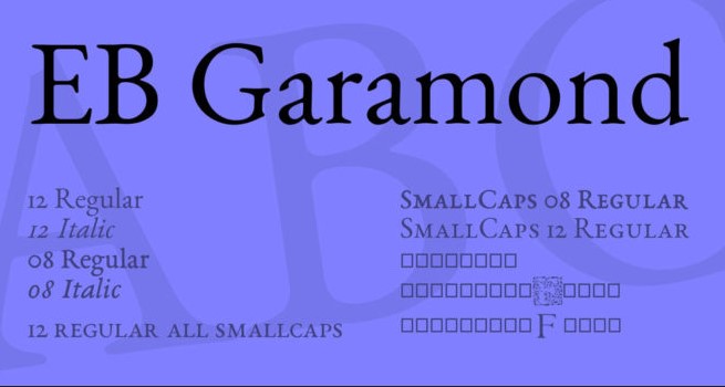
The legibility of font should considered to determine a good font. You can try writing variety of word using a particular font to see its eligibility. Combine with every type of letters, numbers, etc. You can also try scaling up and down to see if they are still eligible. Font with great eligibility is Garamond. They are still eligible even if you use them in different context from different colors, sizes, to compositions. A good font also has good balance to its thickness and weight, and width. Thus, it makes the font look more interesting and beautiful.
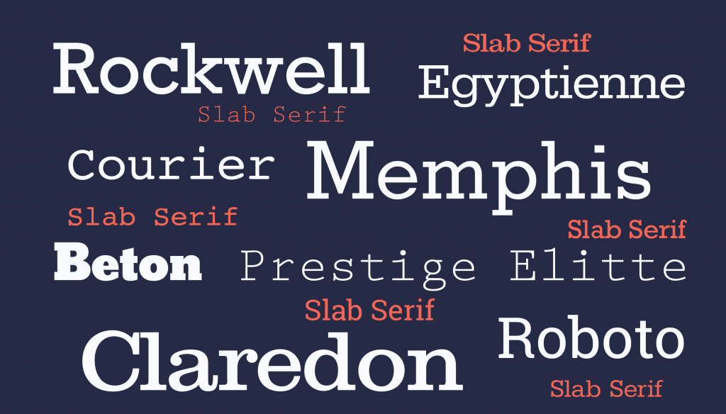
Several best fonts that have been popular for their best characteristics and features are Bodoni, Didot, Futura, Garamond, Helvetica, Gill Sans, Baskerville, Proxima Nova, Verdana, and Clarendon. They fulfill the criteria of what makes a font good. They have also great readability as well as srtictic features to complement their look. Thus, they look beautiful, attractive, while easy to read.